What Makes an Effective Landing Page?

A landing page provides the foundations for any good website. It is critical to get right so that the first point of contact for a user won’t just be their last. In other words, you want to consider conversion rate optimisation (CRO).
While there are various CRO tools and techniques available, we introduce some of the ways that a landing page can be made to draw in customers, providing them with the information and support they need from your organisation.
- User Friendly
First and foremost, any website design should be made considering its audience. As the first place that a user will find themselves, it is essential that a landing page is accessible and purposeful, providing any user with exactly what they are looking for.
Other aspects of a landing page’s style and function, as discussed below, must be made with this most important principle in mind.
- Easy to Follow
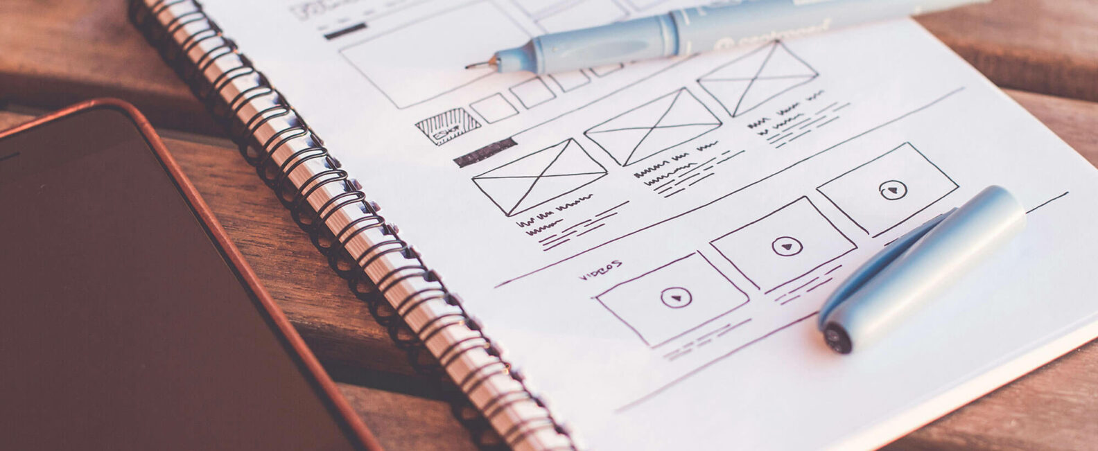
Even if the rest of your website is perfect, a landing page must guarantee that a user is able to get there. The key to ensure easy navigation is the right balance of information and action points – enough for any user to know exactly what your company is about and what they can do with the website, but not too cluttered that your message is lost.
You need to have one clear message: what can you do for a customer? At the same time, that message needs to be serviced by multiple points of interaction. A heading bar with pages such as ‘About Us’ and ‘Contact Us’ are one example of how this can be achieved, leading a user inwards for more detail.
- The Right Words
Headers. Taglines. Captions. Text. Choosing careful, useful words means that all of your website’s features, design and graphics make sense. It is the difference between a landing page that helps and hinders your business’ communication to the user.
Particularly for a landing page, it is important to be economical with word choice. Say what you need to say, no more.
- Attention-Grabbing Graphics
Whether it’s video content, logos, animations or slideshows, the old adage is true that a picture can speak a thousand words. Your graphics need to catch the eye and explain exactly what your business is about. They must work alongside any written information to support and fill out the message you want to convey.
Landing page graphics provide the perfect opportunity to express your brand identity and showcase your work. However, it can be easy to get wrong: poor photography, low resolution or slow processing are just some issues that can immediately put off a user. Making sure that you are effectively making use of graphics is vital to ensuring you get the right kind of attention.
- Consistent Design
Your house style is one of the biggest assets you have to express who you are as a company, and has an immediate impact on a user. Are you playful or serious, new or experienced? A house style should communicate the identity of your brand and connect with its target audience.
Fonts, colours, sizes, placement – there are a number of aspects to consider. Have an intention and be consistent when coming up with the core design style of a website.
- Up to Speed
No one likes buffering or lagging. A landing page is a station with many platforms, so it is important that everything runs smoothly. Ensure that a landing page is digitally up to speed with a fast loading speed and quick links.
It is important to consider how a landing page looks and works across multiple devices; optimising a landing page for mobile is necessary to meet the ways that users increasingly shop and search on their phones.
- Calls to Action (CTAs)
The purpose of a landing page is to create engagement. The only way to do that is through a Call to Action (CTA), meaning a feature that requires a user to act. Add links, and not just in the headings bar – consider buttons and clickable graphics and text. Use action verbs (such as buy, follow, browse) that instruct your user on what is possible. A user must always be left with a clear understanding of how they can advance.


